The idea
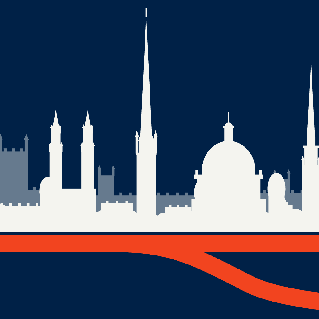
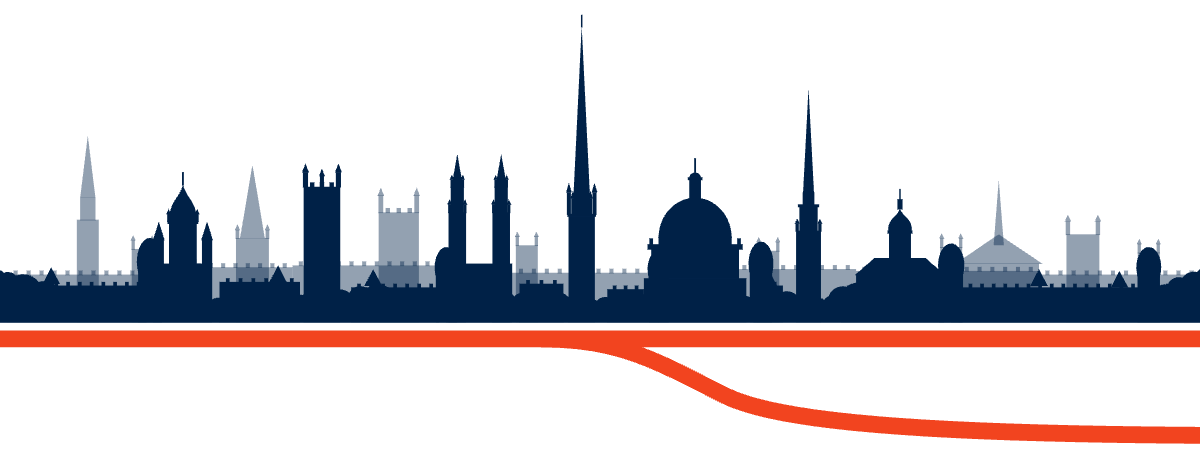
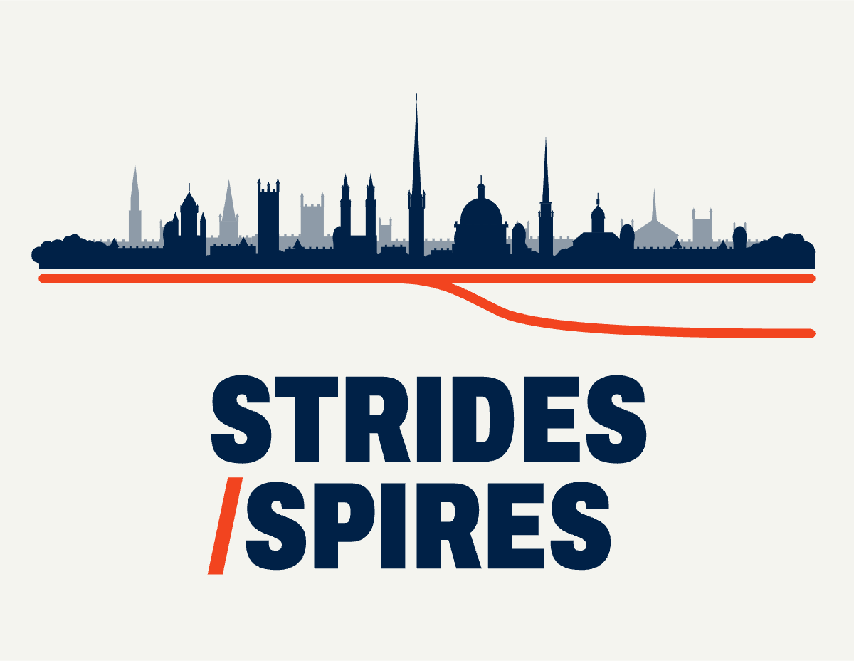
Every walk has a fork. The brand is built on one moment: you stop outside somewhere good and decide whether to go in. The logo shows Oxford's skyline, seen from South Park, standing on a route that splits in two. One road goes in, the other keeps walking.
The logo
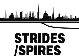
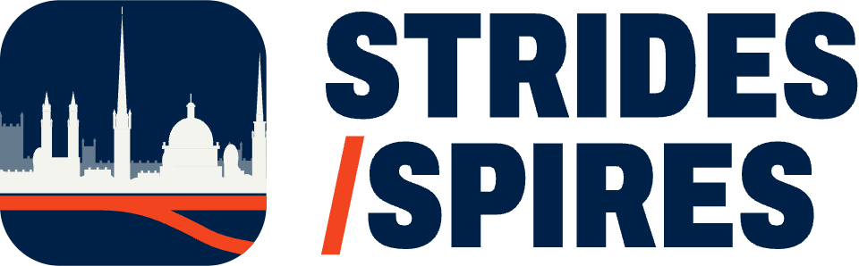
Three parts that always travel together: the skyline, the route that forks underneath it, and the condensed wordmark with a vermilion slash. The skyline is wider than the name on purpose, so it reads as a view rather than a strip.
Lockups
Use this wherever there is room: splash screens, posters, the website hero, merchandise.
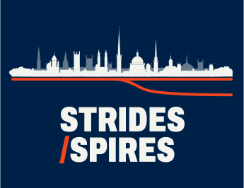
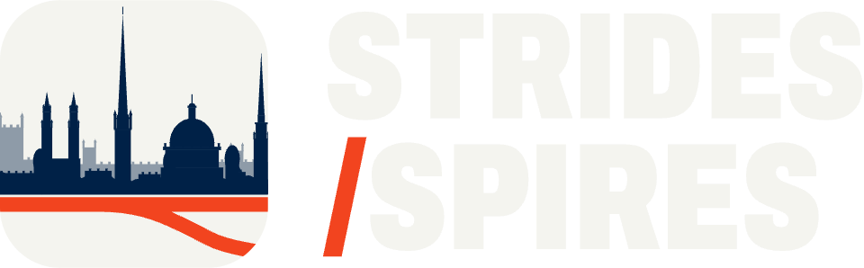
Blue is the home ground. Paper skyline and wordmark, vermilion route.
For headers and anything wide and short: the app's explore screen, the website nav, email signatures.
The wordmark alone for tight spaces where the icon is already nearby. The skyline alone as a decorative band, never as the logo.
Space and size
X is the height of the capital S in the wordmark. Keep at least X clear on every side. Nothing goes inside the dashed line.
Below these sizes the spires start to merge. Use the app icon instead, or the 16 px favicon glyph.
Colour versions
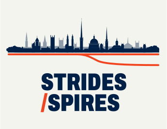
Full colour on paper or blue first. One-colour versions are for single-ink print, embossing and engraving. The paler back row of colleges becomes a tint of the same ink.
App icon and favicon
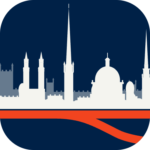
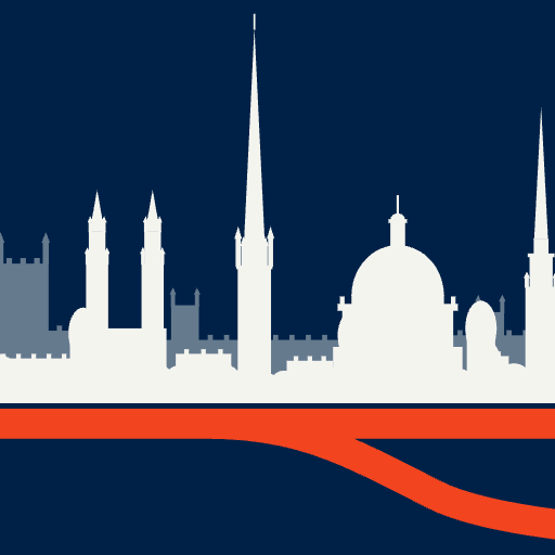
The icon crops in on the middle of the view: All Souls, St Mary's and the Radcliffe Camera, with the route splitting below. At 16 px there is not enough room for that, so the favicon uses a simplified dome-and-spire glyph drawn for that size.

The finish stamp
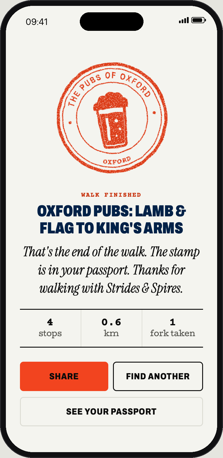
A passport-style stamp you earn at the end of a walk. It is a reward and a sticker, not a second logo, so it never appears instead of the main mark.
- The walk-finished screen, tilted a few degrees like a real stamp.
- Stickers, tote bags and pin badges.
- Social posts when someone finishes a walk.
- Not on the app icon, the header or anywhere the logo already is.
Colour
Paper and Oxford blue do most of the work. Signal vermilion is rationed: it marks the route and the go button, so when you see it you know where to go.
Paper#F4F4EF · RGB 244 244 239The main ground. Warm, not white.
Oxford blue#002147 · RGB 0 33 71Logo ground, headers, the go-inside box.
White#FFFFFF · RGB 255 255 255Cards and phone screens.
Ink#0B0B0B · RGB 11 11 11Text, and the keep-walking outline.
Signal#F2441F · RGB 242 68 31The route and the go button. Nothing else.
Rough share of a typical screen
Supporting colours
#C7330FSmall vermilion text on paper#FF8A6BPrices and accents on blue#55554FSecondary text#DCDCD4Rules and borders#E6E6DFQuiet fills#9CC7F0Small accents on blue#BFCDE0Secondary text on blue#2E6B3AFree, done, approved| Pair | Contrast | Use |
|---|---|---|
| AaInk on paper | 17.8 : 1 | AAA |
| AaBlue on paper | 14.5 : 1 | AAA |
| AaPaper on blue | 14.5 : 1 | AAA |
| AaSignal text on paper | 4.9 : 1 | AA |
| AaSignal on blue | 7.0 : 1 | AA |
| AaInk on signal (buttons) | 5.3 : 1 | AA |
| AaSignal on paper | 3.4 : 1 | Route and shapes only |
| AaMute on paper | 6.8 : 1 | AA |
Bright signal on paper is only 3.3 : 1, so it is fine for the route and shapes but small vermilion text uses the darker signal text colour instead.
Type
Four free fonts, each with one job. All are under the SIL Open Font Licence, so they can be used in the app, on the web and in print with no fees. They are included in the pack.
Choose the rest.
- Weight
- Black (900)
- Width
- 72%, condensed
- Case
- Capitals, tight leading (0.86)
- Weight
- Extra bold (800)
- Width
- 85%
- Case
- Capitals, tracked +4%
- Use
- Descriptions, directions, anything you read
- Size
- 15 to 18 px
- Use
- Prices, distances, times, small capitals labels
- Weight
- Bold (700)
- Use
- Only for words the guide actually says. It tells you you're hearing a person.
The two boxes
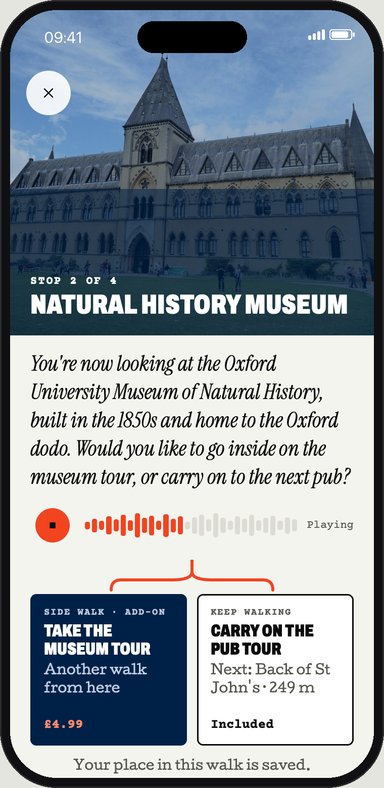
The choice screen is the brand's signature. It is the logo's fork, turned into a decision you make on the pavement.
You're now looking at the Oxford University Museum of Natural History, built in the 1850s and home to the Oxford dodo. Would you like to go inside on the museum tour, or carry on to the next pub?
- Always two. Go inside or keep walking. If a stop has more options, it is two forks, not three boxes.
- Side by side, same size. Neither option is pushed. Never stacked, never a big and a small one.
- The split line above. A vermilion line comes down and forks into the two boxes.
- Inside is filled, onward is outlined. Blue fill for going in, an ink outline for walking on.
- Price where you can see it. Bottom of the box, in Courier Prime. "Included" when it costs nothing extra.
- The walk remembers. After a side tour, you are back where you left off.
The route line
One vermilion line, 5 px with round ends at app scale, is the brand's only graphic device. It is the route on the map, the fork in the logo and the line down a tour's stop list. One route per view: if everything is vermilion, nothing is.
Voice
Write like a friend who knows Oxford and is walking next to you. Second person, short sentences, a real opinion now and then. These lines are from the first tour.
Fancy going in for a pint, or shall we keep walking?Lamb & Flag · the first fork
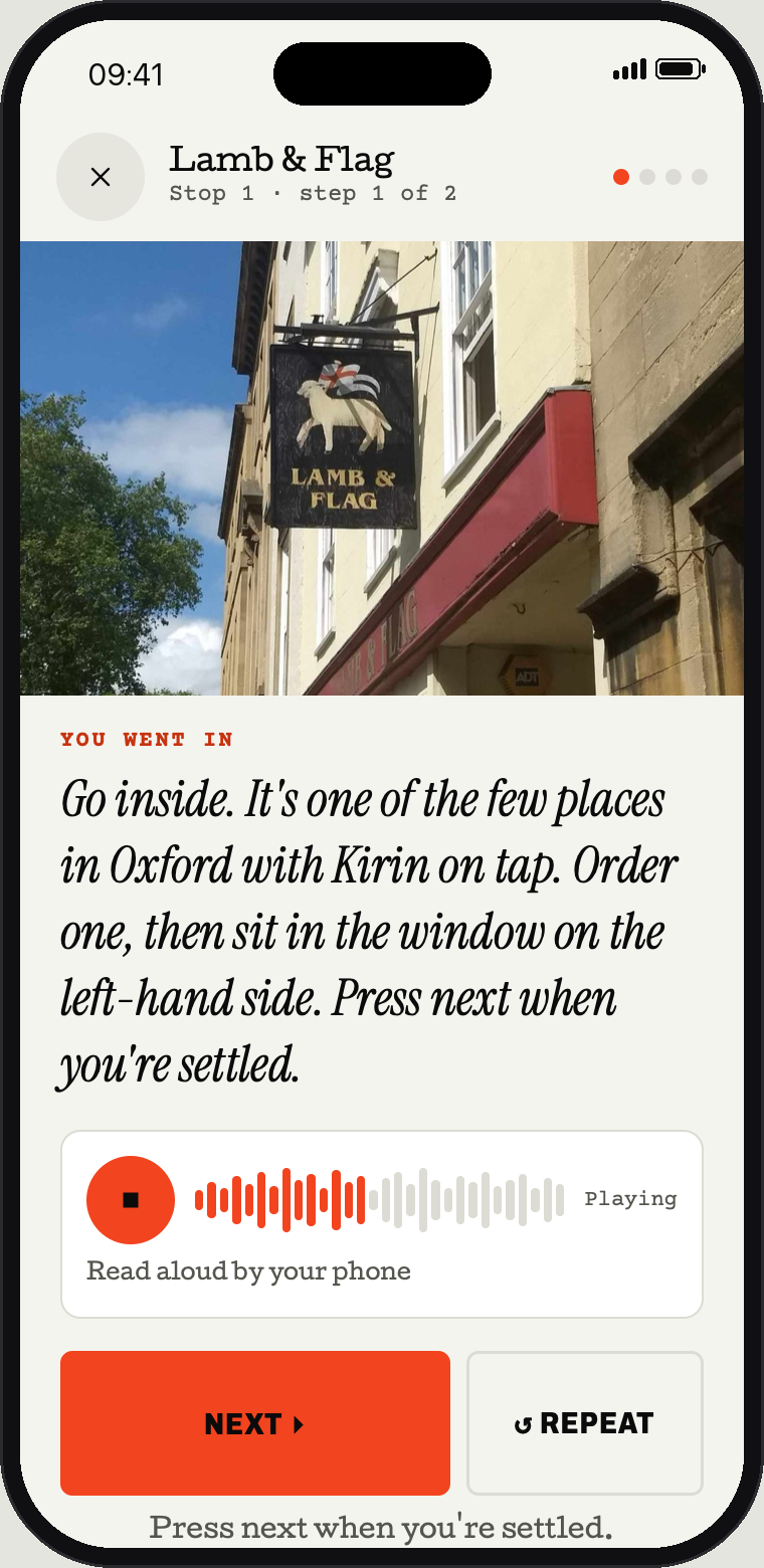
It's one of the few places in Oxford with Kirin on tap.Lamb & Flag · inside
That's the Eagle and Child, the other pretender.Lamb & Flag · inside
This is the King's Arms, open since 1607.King's Arms · the end
Do
- Say what to do next: "Press next when you're settled."
- Give one good detail, not five.
- Use real names: Museum Road, Parks Road.
- Put the choice as a question.
- Button labels are verbs: Take the museum tour.
Don't
- "Unlock", "curated", "hidden gems", "immersive".
- Dates and facts you can't stand behind.
- Exclamation marks.
- University jargon without explaining it.
- Selling inside the walk, beyond the choice itself.
In the app
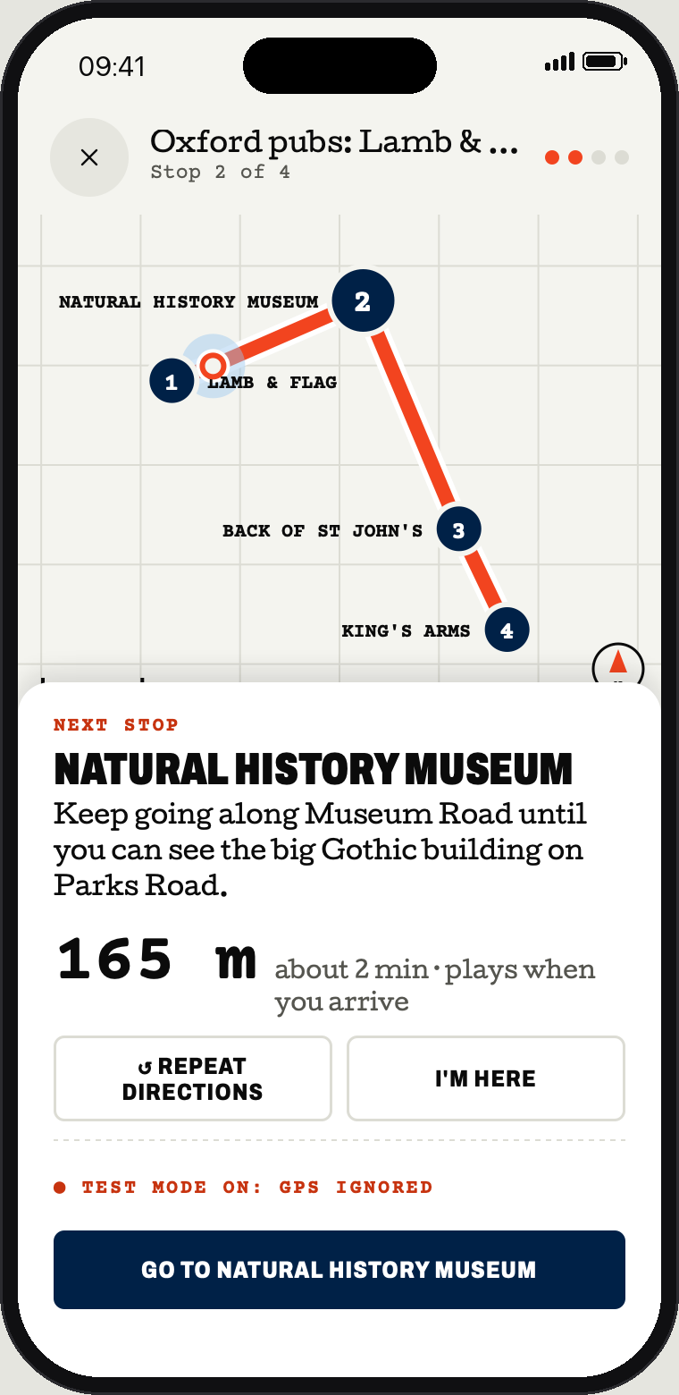
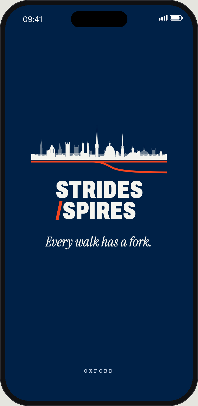
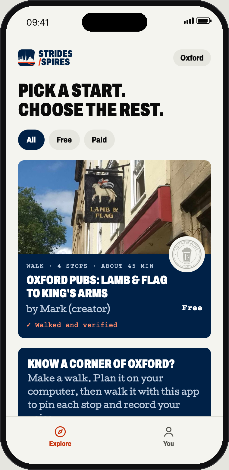
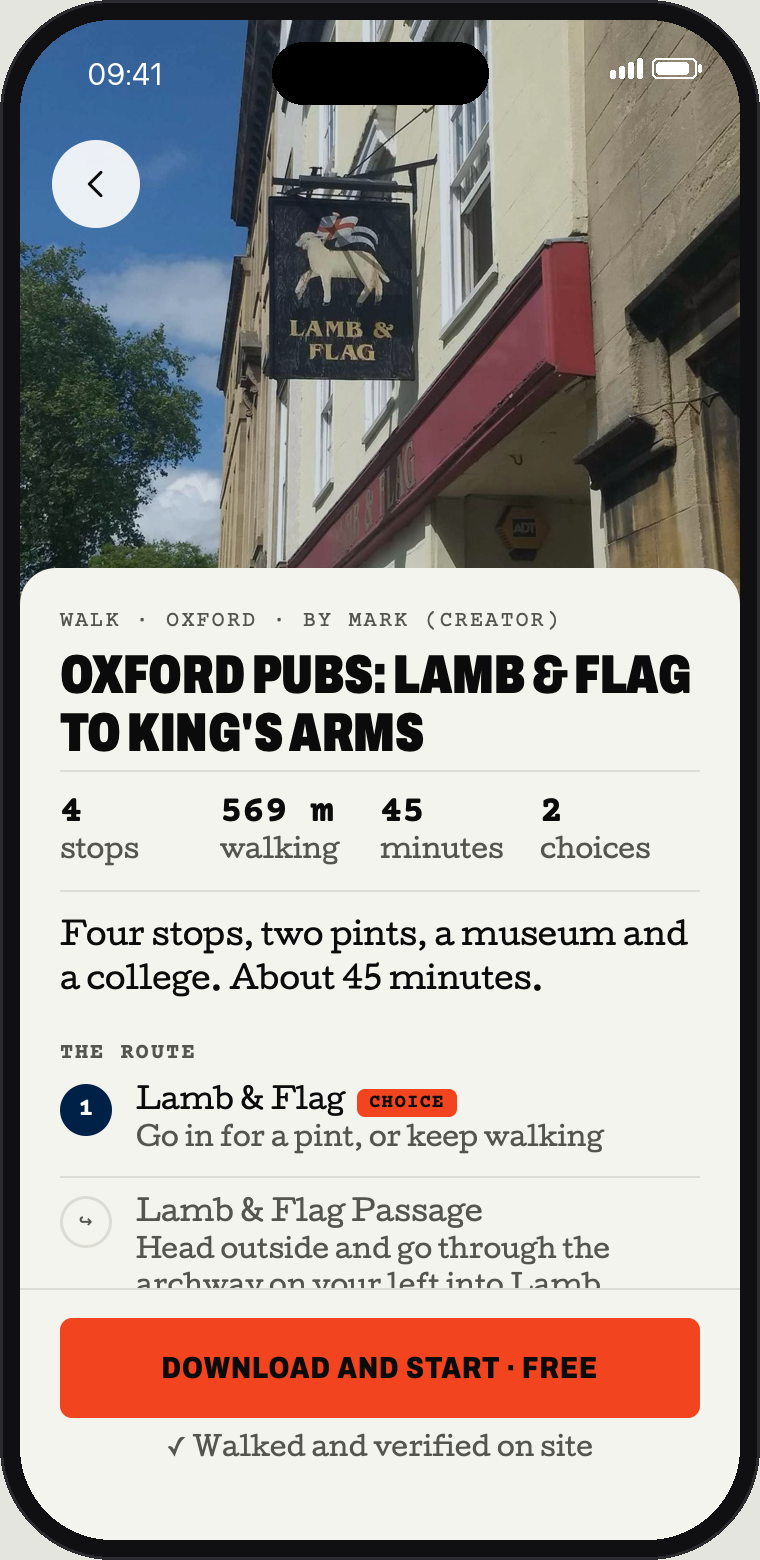
The approved Fork screens with the final logo. The tours, stops, prices and script lines are the real ones from the app. Distance and audio times are illustrative.
Photography
Real places at eye level, in daylight, the way you see them when you arrive. Doors, windows, a pint on a table, people walking away from the camera. Skip the drone shots and the punts at sunset. The photos below are Wikimedia Commons stand-ins until there is a commissioned shoot.
Don'ts
The logo is drawn to work as it is. These are the common ways it gets broken.
Files
Every logo is outlined artwork, so it looks the same everywhere with no fonts installed. Use SVG wherever you can and PNG where you can't. Download everything as one zip (5.3 MB).
Logo, vector (SVG) 17 files
- favicon.svg
- horizontal-colour.svg
- horizontal-reverse.svg
- icon-square.svg
- icon.svg
- skyline-colour.svg
- skyline-reverse.svg
- stacked-colour.svg
- stacked-mono-ink.svg
- stacked-mono-white.svg
- stacked-on-blue.svg
- stacked-on-paper.svg
- stacked-reverse.svg
- stamp-colour.svg
- stamp-reverse.svg
- wordmark-colour.svg
- wordmark-reverse.svg











Logo and icons, raster (PNG, transparent) 26 files
- favicon-16.png
- favicon-32.png
- favicon-48.png
- horizontal-colour-480.png
- horizontal-colour-960.png
- horizontal-reverse-480.png
- horizontal-reverse-960.png
- icon-512.png
- icon-square-1024.png
- icon-square-180.png
- icon-square-192.png
- icon-square-512.png
- skyline-colour-1200.png
- skyline-reverse-1200.png
- stacked-colour-1200.png
- stacked-colour-600.png
- stacked-mono-ink-1200.png
- stacked-mono-white-1200.png
- stacked-on-blue-1200.png
- stacked-on-paper-1200.png
- stacked-reverse-1200.png
- stacked-reverse-600.png
- stamp-colour-600.png
- stamp-reverse-600.png
- wordmark-colour-800.png
- wordmark-reverse-800.png








App screens (PNG, 2x) 7 files
Design tokens 2 files
Before it goes public
- Trade mark. Run a UK IPO search on "Strides & Spires" and the skyline device before registering or printing. The likely classes are 9 (the app), 39 (arranging tours) and 41 (guided tours). Ask a trade mark attorney for a clearance search before any merchandise is made.
- Buildings. The skyline is our own drawing. Commons photos were used for proportions only. No university or college crests or marks appear anywhere.
- Fonts. Archivo, Cutive, Courier Prime and Instrument Serif are all under the SIL Open Font Licence. Licence files are in the fonts folder.
- Photos. The photos here are Commons stand-ins with their own licences, credited below. Commission our own before launch.